Getting started
Getting started
From your first photo to your first exported print in ten minutes: what you need, how to open a photo, choose a style, adjust it and export it.
Ten minutes, one photograph, one print. This chapter takes you through it step by step: by the end you’ll know how Procol moves and where to look for the rest.
What you need#
- A recent browser: Chrome, Edge, Safari or Firefox, kept up to date. Procol draws the print with the computer’s graphics card (WebGL2): if the browser doesn’t offer it, a notice appears where the photo should be.
- A screen from tablet size up. Procol is designed for the computer and the tablet. Below 1280 points wide the menu bar folds into the ☰ Procol button, but everything stays within reach.
- A photograph in JPEG, PNG or WebP. Procol also reads AVIF, GIF and BMP, and the RAW files of the most common cameras, which it develops itself (see Questions). TIFF and HEIC depend on the browser.
The most complete browser for Procol is Chrome (or Edge): it’s the only one that lets you install the app with a menu command, choose where to save each file and send batch processing straight into a folder. In the other browsers Procol works just the same, and files end up in your downloads.
Installing Procol as an app#
Procol opens at app.procol.it, like a web page. If you want it in the Dock or the Start menu like your other apps, with a window of its own and no address bar, in Chrome and Edge choose Procol › Install Procol as an App… and confirm. The item is only active when the browser allows installation; if you’ve already installed it, it stays greyed out.
In Safari and Firefox that item never lights up: the browser doesn’t allow Procol to do it. You can still work in the browser tab, and after the first visit Procol works without a network too.
- A Mac with macOS 15 or later. Procol is downloaded from the Mac App Store; it doesn’t use the network to work.
- A photograph in JPEG, PNG, TIFF, HEIC or another image format macOS can read.
Without a subscription you can use all of Procol: only the exported print carries the watermark. The subscription and the free trial are explained in Procol for Mac.
The first launch#
At startup Procol’s card appears for a few seconds, then fades by itself; a tap, a click or a key closes it at once. If a new version has come out in the meantime, the card stays and asks you Update or Later (see Frequently asked questions).Without a subscription the card stays and offers Continue without a subscription or Subscribe (see Procol for Mac).
With no photo the bench is empty: in the middle the easel invites you to drag in a picture, and the inspector on the right is dark.

1. Open a photo#
There are three ways in; pick the one that comes most naturally:
- drag the photograph from the Finder or File Explorer into the window;
- paste it with ⌘ V if you’ve copied it from another app;
- press Open photograph… in the middle, or choose File › Open… (⌘ O).
A RAW shows up first as a preview, after a couple of seconds, and at full resolution shortly after: you can start straight away, and the work you’ve done stays. Meanwhile a bar in the middle of the photo shows how far the development has got.
The last ten photos you opened stay in File › Open Recent: Procol keeps a copy of them in the browser, on your computer, because the browser can’t reopen a file from its path.The last photos you opened stay in File › Open Recent, as in every Mac app.
2. Or use the test target#
If you haven’t got a photo to hand, or want to understand what a command does, press Use the test target in the middle (also File › Test Target, ⇧ ⌘ T). It’s a synthetic image: a sky with clouds, a landscape, a grey scale and a palette of colours.
It’s the quickest way to learn. The colours in the palette show you at once what filters and emulsions do: a red filter darkens blues and lightens reds, and on the test target you see it in an instant, patch by patch.
3. Choose a style#
In the left sidebar, under the Styles tab, each thumbnail is a complete recipe, from film to toner. Tap a thumbnail: the print changes, and the inspector on the right shows the name of the style.
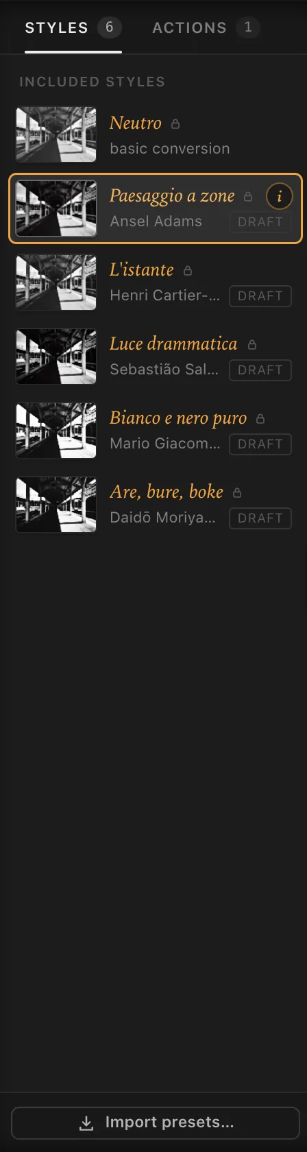
For a first try, choose by the photo:
- a landscape with sky: Paesaggio a zone, inspired by Ansel Adams;
- a street scene: L’istante, inspired by Henri Cartier-Bresson;
- dramatic light, clouds, hard contrasts: Luce drammatica, inspired by Sebastião Salgado;
- a graphic photo, made of marks: Bianco e nero puro, inspired by Mario Giacomelli;
- a night, a rough, blurred picture: Are, bure, boke, inspired by Daidō Moriyama;
- if you want to see the photo ‘as it is’ in black and white: Neutro.
To move from one style to the next without touching the column, use Image › Previous Style and Next Style (⌥ ↑ and ⌥ ↓⌘ [ and ⌘ ]). The i on each thumbnail opens Style info: how the style was conceived, and the recipe stage by stage. Everything else is in The styles.
4. Set the strength#
Under the histogram, at the top of the inspector, is Style strength. At 100% you have the full style; as you go down, the print moves towards the neutral conversion. At 50% you’re halfway.
It’s for when you like a style but it’s too much: a Moriyama at 60% keeps its character without eating the photo. Double-click the label to go back to 100%; the most common amounts are also in Image › Style Strength.
5. Adjust with the Essentials#
Under the strength you’ll find the Essentials block: four sliders for everyday corrections.
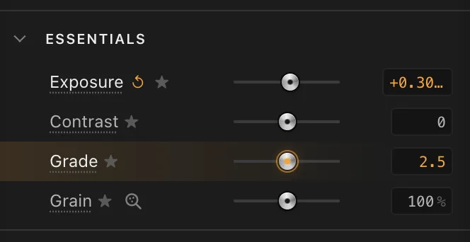
- Exposure: how much light reached the film when the picture was taken. If the print is too dark, add some; if the highlights are blown, take some away.
- Contrast: widens or narrows the distance between shadows and highlights.
- Grade: how hard the paper is, from 0 (softest) to 5 (hardest); 2 is normal contrast.
- Grain: how much the silver grain shows.
Drag a slider and watch the print. Next to the label ↺ appears: tap it to go back to the style’s value. The − and + buttons at either end of the slider move it by a coarse step; the mouse wheel over the slider gives the fine adjustment.
Every move goes into the history: if you get it wrong, Edit › Undo (⌘ Z) takes you back one step.
When you want to go further#
The Essentials are shortcuts: they move the same values you find in the stages. When a correction isn’t enough, open a stage in the inspector by tapping its name. For example:
- is the sky too light? In 3 Camera try a yellow, orange or red filter, as you would in front of the lens;
- doesn’t the grain have the right character? In 2 Film change the emulsion and the format.
Each stage is explained in its own chapter, starting from the analogue chain. Without a licence the stages open and can be read, but adjusting them needs a licence (see Licence and privacy).Without a subscription everything can be adjusted: only the exported print carries the watermark (see Procol for Mac).
6. Look before and after#
Two ways of judging whether you’re getting better:
- hold down Original on the tool strip to the left of the print (or the space bar): you see the starting photo until you let go;
- press Compare (C): the view splits, the original on the left, the print on the right. Drag the line to move it.
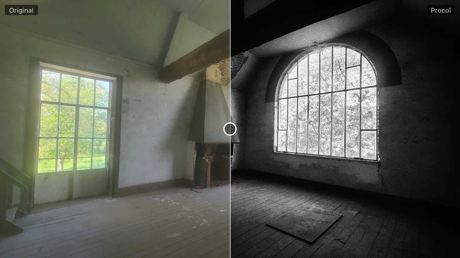
To judge the grain, look at the print at 100%: tap the magnifier in the status bar, at the bottom right, or press 1. At 100%, one pixel of the photo is one pixel on screen: the only honest way to see grain. More tools for looking are in Viewing and checking.
7. Export the print#
When the print convinces you, choose File › Export… (⌘ E). A window opens with a few choices:
- Format: JPEG for the screen, the web and most labs; PNG or TIFF for the archive;
- JPEG Quality: the suggestion is 92%, which is right nearly every time;
- Size: Full resolution, that is the size of the original photo, or a smaller long side for the web;
- Name: Procol suggests the photo’s name followed by the style’s short name (for example montagna_adams).
Press Save to… and choose where to put it. The print is worked out again at the photo’s full resolution: it isn’t a copy of the preview. All the details, dpi included, are in Exporting and printing.
8. Keep the recipe#
If you’ve found an adjustment you want to use again on other photos, save it as a preset: File › Save Preset… (⌘ S), or the Save preset… button at the bottom of the inspector. You give it a name and find it in the Styles column, under My presets. How to work with presets, actions and history is explained in Working in order.
What next#
- Take a tour of the screen with The interface.
- Read the analogue chain to understand what each stage does.
- Look for an idea in the Recipes.
- Keep the Keyboard shortcuts and the Glossary close at hand.