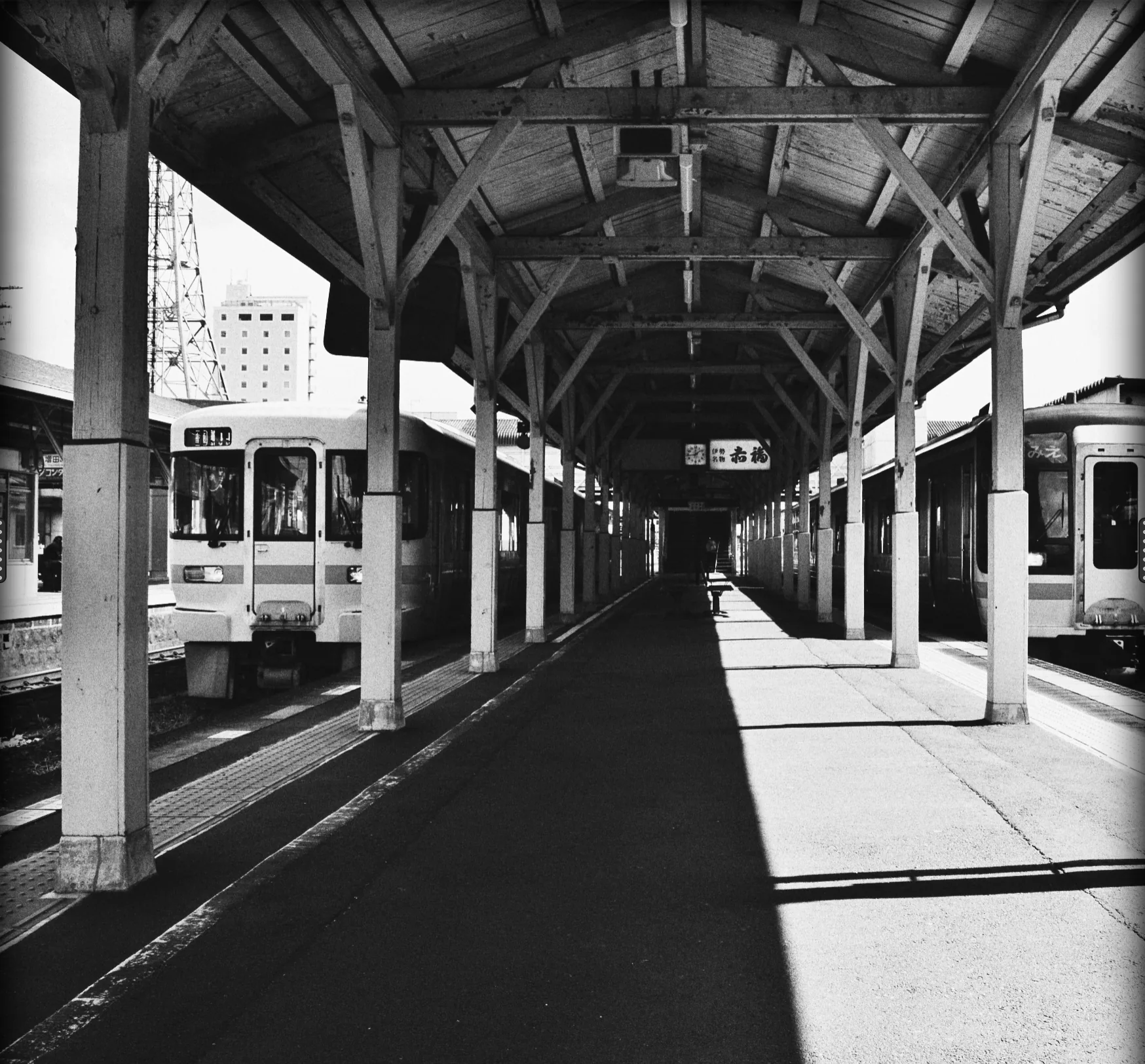
The analogue chain
The grain editor
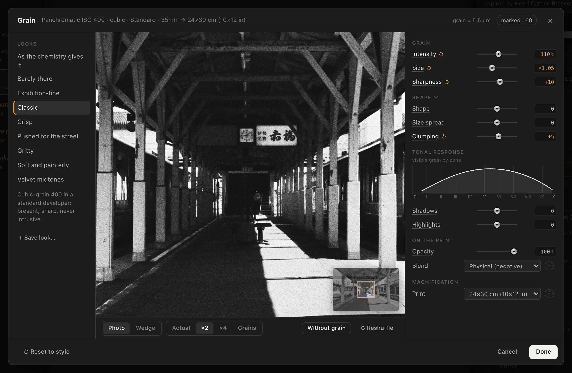
The grain editor pop-up in Procol: the loupe on the print at actual size, the microscope on the grains, the grain looks, the grain shape and the tonal response zone by zone.
Grain is the signature of black and white. It is what sets a darkroom print apart from a converted photograph: a fabric of silver that gives the greys their body, showing in the midtones and drawing back in the whites. The prints of the great photojournalists between the ’60s and the ’90s each have their own grain, born of a film, a developer, a degree of enlargement.
The grain editor is the bench where you look at it up close and adjust it. It is a window of its own, with a loupe on the print at its true size, a microscope on the grains, ready-made grain looks and a graph that tells you where the grain shows.
Opening the editor#
The editor opens when there is a photo. Four ways in, all to the same place:
- the Grain editor… button at the bottom of the Grain group in Film;
- Editor in the header of the Grain group;
- the small loupe next to Grain in the Essentials, at the top of the inspector;
- the Darkroom › Grain Editor… menu.
The editor has no chemistry of its own: it adjusts the same values as the Film stage, and every change goes into the history like any other. The grain always starts from what the emulsion, the exposure index, the developer, the format and the print size give; the editor works on top of that.
The header#
At the top, next to the title, the editor reminds you where the grain starts and where it ends up:
- the chemistry: emulsion, developer, exposure index if you pushed or pulled the film, negative format and print size, for example ‘Panchromatic ISO 400 · cubic · Standard · 35mm → 24×30 cm (10×12 in)’. You change these in Film and Development;
- the grain in microns on the negative, for example ‘grain ≈ 5.2 µm’: the typical diameter, from emulsion, developer and Size;
- the grain index with its word, for example ‘marked · 57’: how much the grain shows in the print seen from 35 cm (see The grain index). With the grain at zero it says ‘none’.
Grain looks#
On the left, the Looks list: recipes that touch only the grain, on top of the chemistry. The emulsion, developer, format and print size stay the ones you chose; the look changes how much grain there is, how large, how sharp, how clumped and where it shows. Tap a name to apply it; its description appears under the list.
| Look | How it appears |
|---|---|
| As the chemistry gives it | Square one: the grain that emulsion, developer, exposure index and format give on their own. |
| Barely there | A trace of silver: the print doesn’t look digital, the grain goes unnoticed. |
| Exhibition-fine | Small, even grain, smooth midtones: large format, fine-grain developer. |
| Classic | Cubic-grain 400 in a standard developer: present, sharp, never intrusive. |
| Crisp | A high-acutance developer: every grain has an edge, perceived sharpness rises. |
| Pushed for the street | Pushed two stops: obvious clumps, grain rising in the shadows. |
| Gritty | Coarse, hard grain, visible in the highlights too: high-contrast prints. |
| Soft and painterly | Broad, soft-edged grains, like a matt paper and a diffusion head. |
| Velvet midtones | The grain lives in the midtones and draws back from shadows and highlights. |
The active look stays highlighted as long as the sliders match its values. Move a slider and under the list you read ‘Custom values.’
Your own looks. When you have found a grain you like, tap + Save look…, type a name and tap Save. The look appears under Mine and applies to any photo. To remove it, tap the × next to its name. Looks are saved in this browseron this Mac.
The loupe#
In the centre, the print seen up close.
Photo or Wedge#
- Photo: your photograph, through the whole chain.
- Wedge: a grey scale with eleven steps, from Zone 0 to Zone X, and below it a continuous gradient, run through the same chain as the photo. It lets you see the grain tone by tone, without the subject distracting you: in the dark and light steps it dies away, in the midtones it shows.
Magnification#
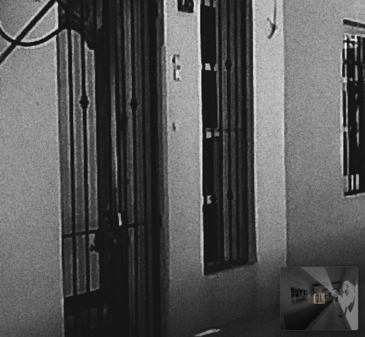
- Actual: the print at its true size on screen. Look at it from about 35 cm: that is what someone will see when it hangs on the wall.
- ×2, ×4: two and four times actual size, the grain up close. ×2 is what the editor opens with the first time; after that it remembers your choice.
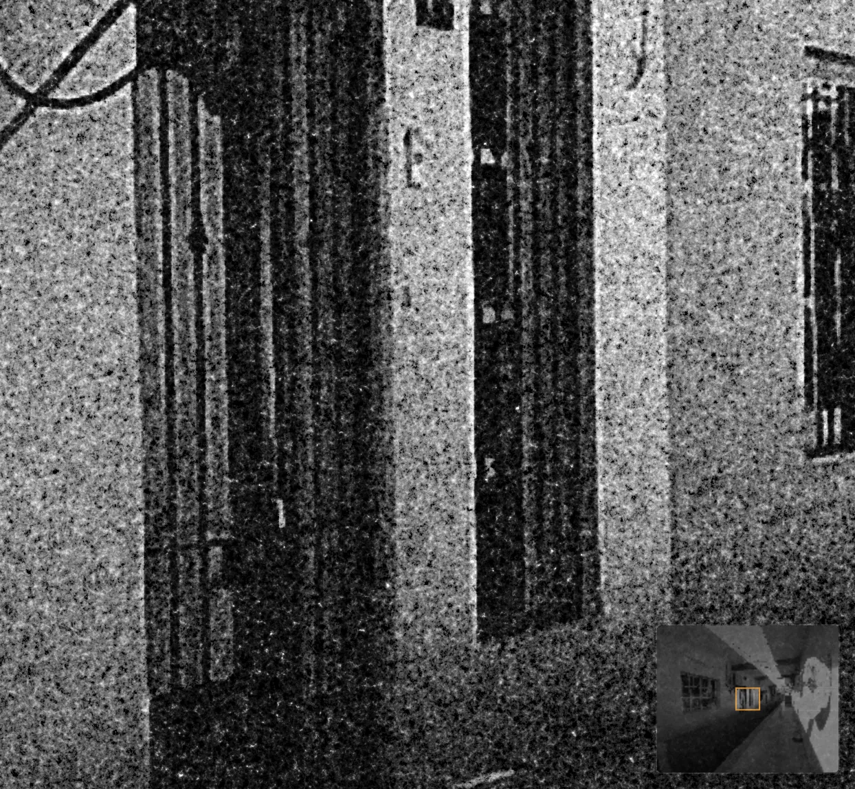
- Grains: the negative under the microscope, the grains one by one over a 100-micron field, with a 10-micron scale bar. Here the print no longer counts: you see the silver on the negative. With Wedge under the microscope only the gradient remains: from left to right the negative goes from thin to dense, and you watch the grains crowd together.
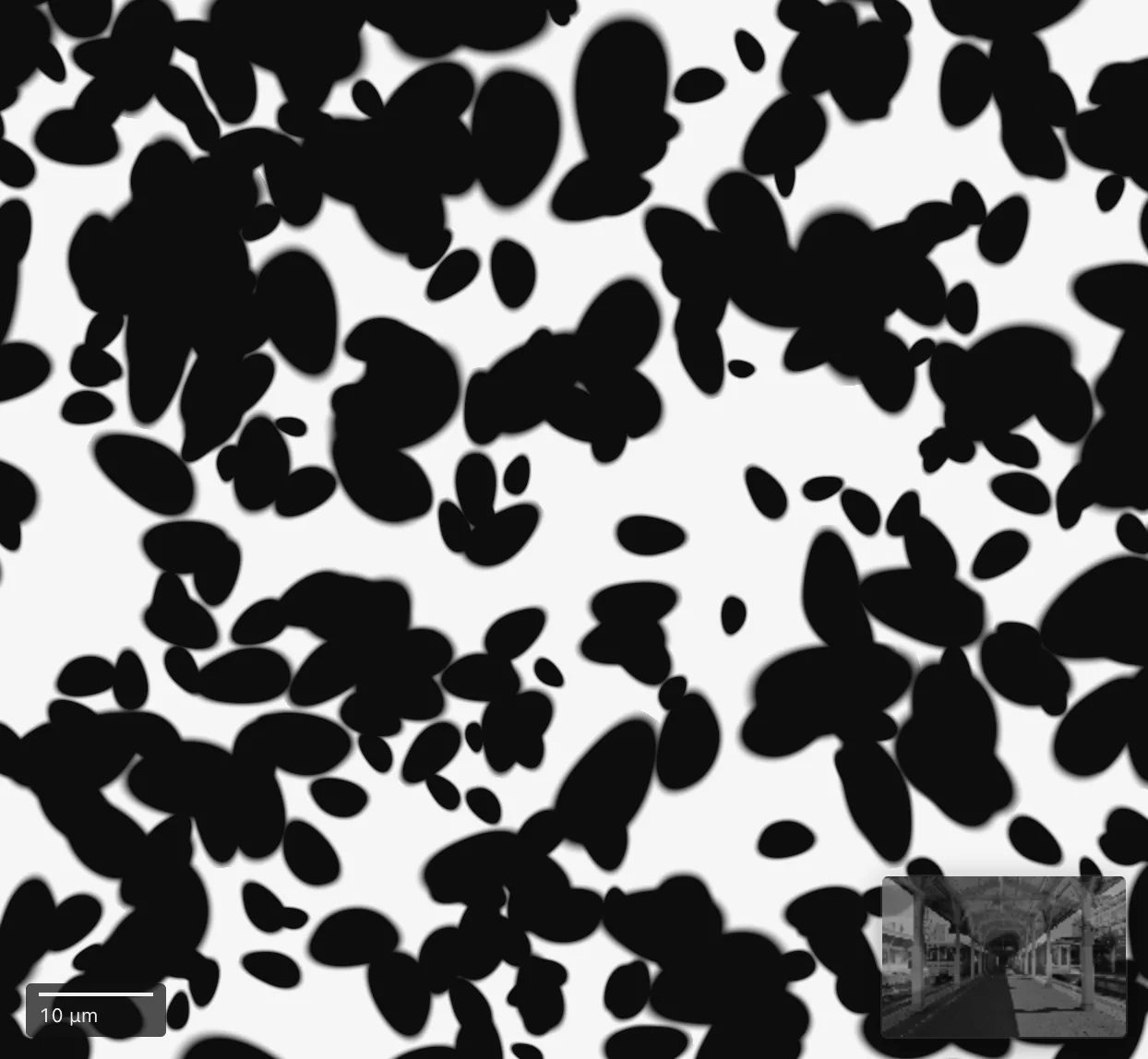
Moving around the print#
Drag inside the loupe to move around. In one corner the navigator appears, the whole photo in miniature with an amber frame: that is the part you are looking at. Tap a point on the navigator to jump there. The navigator doesn’t appear when the loupe already shows the whole print, nor when the photo is cropped with the Crop.
Without grain and Reshuffle#
- Without grain: press and hold the button to see the same print with no grain; let go and the grain comes back. It is the most honest way to judge how much the grain adds.
- ↻ Reshuffle: the same grain, the grains in new positions, like another frame on the same roll. Useful when a clump lands right on the eye in a portrait.
The sliders#
On the right, the sliders are the same as in Film, grouped by what they do. Moving them here or there is the same thing. The row of a value that departs from the style lights up, as in the inspector.
Grain#
How much, how large, how sharp, relative to what the chemistry gives.
- Intensity (0% to 200%, default 100%): this is the Grain slider in Film. 100% is the grain of the chemistry, 0% takes it away, 200% doubles it.
- Size (×0.50 to ×2.00): smaller or bigger grains; bigger ones are also grainier.
- Sharpness (−50 to +50): from soft and mushy to crisp.
Shape#
A group that folds away with a tap on its title (the editor remembers whether you left it open or closed). Its effects show best at the Grains magnification: if you move one of these sliders at another magnification, the editor reminds you.
- Shape (−50 to +50): round, compact grains, or elongated, irregular ones. In the print it shows in the clumps, which stretch out: the ‘wormy’ grain of pushed fast films.
- Size spread (−50 to +50): grains all alike, as in a slow sheet film, or big and small mixed together, as in a pushed fast film.
- Clumping (−50 to +50): grains spread evenly, as in a tabular-grain film, or gathered into clumps, as in a pushed cubic-grain film.
Shape, Size spread and Clumping change how the grain looks, not how much there is: the grain index doesn’t move.
Tonal response#
The visible grain by zone graph shows how much grain you see on the print, zone by zone, from Zone 0 (black) to Zone X (paper white). The curve rises in the midtones and falls towards the extremes: it is the paper that decides where the grain shows. Hold the pointer over the graph to read the grain at middle grey, as a percentage of the tone.
- Shadows (−100 to +100, default 0): less or more grain in the shadows of the print, from half to double.
- Highlights (−100 to +100, default 0): the same in the highlights.
When you move them, the graph shows the starting grain, the chemistry’s, as a dashed line: you see at once what you have taken away or added. Middle grey doesn’t change, so neither does the index.
Example. A portrait with the skin in the midtones and a black background: Shadows at −50 cleans up the background and leaves the grain on the face.
On the print#
- Opacity (0% to 100%): the grain as a layer on the print; at 50% you see half of it.
- Blend: Physical (negative), Soft, Hard. See Blend in Film.
Magnification#
- Print: the print size, from 13×18 to 100×150 cm. Changing it here changes the Actual loupe and the index: it is the most direct way to see that the same grain, on a bigger sheet, becomes something else.
Closing#
At the bottom of the window:
- ↺ Reset to style brings the grain back to the values of the chosen style;
- Cancel closes and puts the values back as they were when you opened the editor, print size and grain layout included. Esc cancels too;
- Done closes and keeps the changes. The × at the top does the same.
Grain recipes#
A few starting points. Each recipe begins in Film and Development, then gets refined in the editor.
- 1960s reportage, exhibition print. Panchromatic ISO 400 · cubic, 35mm, Standard developer at time N, print 30×40. In the editor, the Classic look. Look at it at Actual: the grain should show, not shout.
- Night in the city, pushed. Panchromatic ISO 400 · cubic Rated at 1600 +2, High-acutance developer, Condenser head in the Enlarger. In the editor, Shadows at +20 if you want the grain inside the dark.
- Grain as material. High-speed ISO 3200 or Recording film ISO 1000, print 50×60, the Gritty look. Check with Without grain how much the grain is bringing.
- Smooth landscape. Tabular-grain ISO 100 on Medium format 6×7, Fine-grain developer. The Exhibition-fine or Barely there look: the grain is there, the print doesn’t look digital, but the eye can’t find it.
- Soft portrait. Panchromatic ISO 125 · cubic, the Velvet midtones look, Blend set to Soft.