The analogue chain
5 · Development
The Development stage in Procol: the developer, the dilution, the time in the tank with N+1 and N−1, edge effects, compensation, agitation and pyro stain.
The negative is born in the tank. The developer and the time decide how contrasty the negative is, how the highlights behave, how crisp the edges are and what character the grain has. This is the stage where you put the second half of the golden rule into practice: expose for the shadows, develop for the highlights.
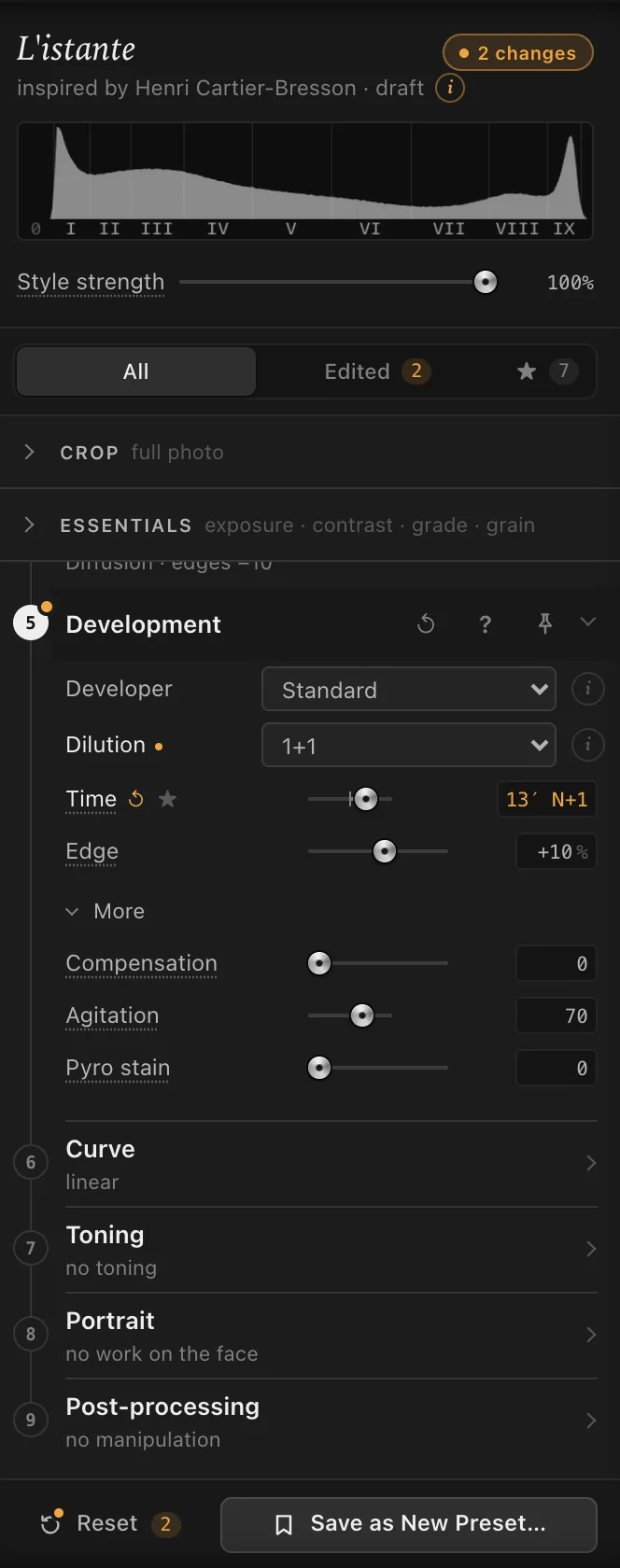
Developer#
Every developer brings its own character: how much it compensates the highlights, how it is agitated, how crisp it makes the edges, what grain it gives and how much time it asks for. Choosing one sets its typical Compensation, Agitation and Pyro stain (in More); after that you can change them.
| Developer | Character | Time, compared with Standard |
|---|---|---|
| Standard | The classic developer at medium dilution, regular agitation. Moderate edge, the reference grain. The default. | the same |
| Fine-grain | Solvent: softer and slightly finer grain, rounder grains, less sharpness. Little edge effect. | about a third longer |
| High-acutance | Dilute, with little solvent action: crisp edges, obvious, well-defined grain. Responds to pushing more than the others. | about 60% longer |
| Two-bath | A moderate compensating developer with a fixed time: the highlights stop while the shadows keep building. Marked edges. | a little shorter, and fixed |
| Stand | Very dilute and almost no agitation: a near-normal curve, edge effects and halos at their strongest, crisp grain. | much longer (nearly an hour), and fixed |
| Staining pyro | A yellow stain, proportional to density, that compresses the highlights, more so on hard grades; the grain looks finer. | about 40% longer |
With the same Panchromatic ISO 400 · cubic in 35mm, printed at 24×30 cm (10×12 in), the developer moves the grain index by a few points: about 55 with Fine-grain, 57 with Standard, 62 with High-acutance and Stand. Not much in figures, but the character changes: soft and round on one side, crisp and defined on the other.
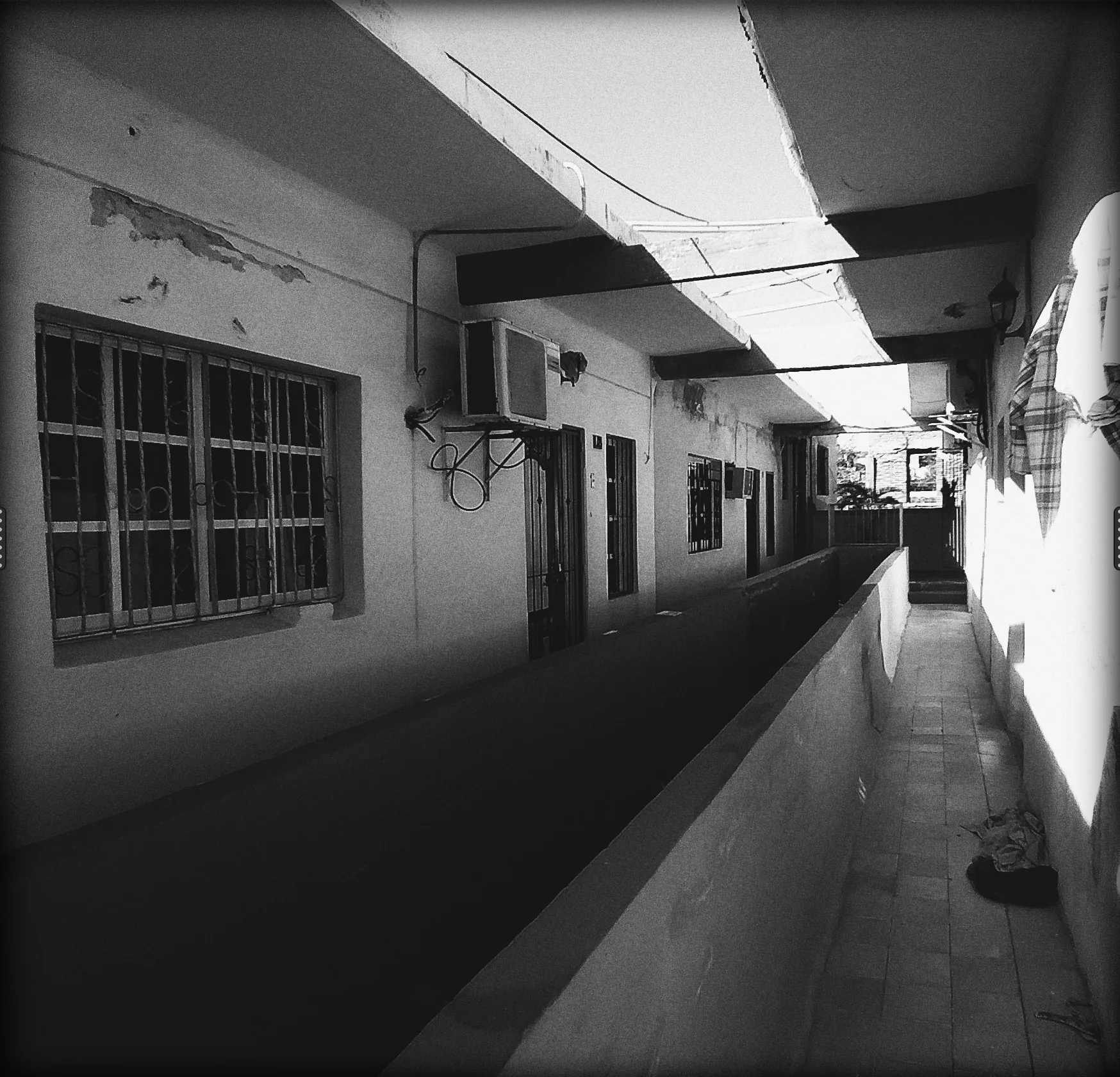
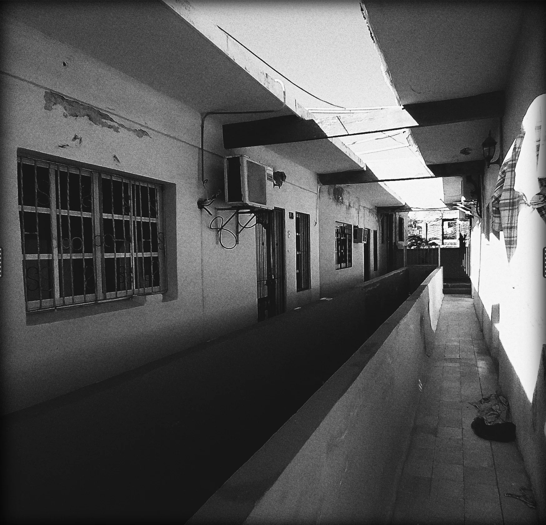
Which one to choose.
- For a balanced negative that prints without fuss: Standard.
- For big enlargements from 35mm, when the grain must stay soft: Fine-grain.
- For apparent sharpness, the street, crisp reportage: High-acutance.
- For a scene with sun and deep shadows, where the highlights risk blocking up: Two-bath.
- For the strongest edge effects, lines that stand out, a certain graphic hardness: Stand.
- For landscapes with bright highlights that rarely block up: Staining pyro.
Dilution#
Stock (the default), 1+1 or 1+3. The more dilute the developer, the more it exhausts where the negative is dense, that is in the highlights:
- Stock: no compensation, finest grain, normal sharpness;
- 1+1: same speed, more sharpness, a shoulder that starts to hold the highlights; the time grows by about half;
- 1+3: compensates for real, holds the highlights, crisps the edges, coarsens the grain a little; the time more than doubles.
The menu isn’t there with Two-bath and Stand, which are dilute by design. In the summary of the closed stage the dilution follows the developer’s name: ‘Standard 1+1’.
Time#
The time in the tank, in minutes and seconds, at 20 °C. The slider runs from N−2 to N+2, in tenths, starting at N.
N is the suggested time for that emulsion, that exposure index and that developer, as in the manufacturers’ data sheets. The readout gives the minutes and, if you move away from N, by how much: ‘6′45″’ for a cubic-grain 400 in Standard, ‘9′ N+1’ one step further on.
- N+1 lengthens the time by about a third with a 400, less with slow films (about a fifth with a 50). Negative contrast goes up, above all in the highlights.
- N−1 shortens it, by 30% with fast films down to 15% with slow ones. The highlights come down.
- Beyond N+1, expansion gives less and less: contrast grows with time and slows down as it nears the emulsion’s limit.
The shadows change little, because they depend on exposure. And the print keeps the middle grey where it was: what changes is the distance between shadows and highlights.
The suggested time lengthens by itself when you push the film with Rated at in the Film stage, and it changes if you change developer or dilution: N stays N, the minutes change.
With Two-bath and Stand the time is fixed and contrast reaches its limit on its own: moving the slider doesn’t change the negative, and pushing the film with them only underexposes it.
When to use it.
- A grey day, a flat scene: N+1, the highlights come up and the print breathes.
- Hard sun, strong contrast: N−1, the highlights come back within the paper.
- A long exposure at night: the Shutter speed readout tells you how much to cut; bring the slider towards N−1.
With the test strip you can choose the time by looking at the bands on the print, as in the darkroom.
Edge#
The edge effect: where a light area meets a dark one, fresh and exhausted developer mix, and the edge gets a little sharper, with a thin fringe that makes the outline easier to read. It is the ‘chemical’ sharpness of negatives, quite different from the sharpening of retouching software.
The model comes from the developer: moderate in Standard, little in Fine-grain, more in High-acutance and Two-bath, a lot and wide (about two tenths of a millimetre on the negative) in Stand, narrow in Staining pyro. It grows with the density of the negative: strong in the highlights of the print, weak in the shadows. It also grows if you agitate less, develop longer or dilute.
The Edge slider, from −100% to +100%, starting at 0%, is the correction by feel: 0% is the model, −100% takes it away, +100% doubles it.
It works on the density of the negative, before the grain. You see it at 100% and in big prints, hardly in the full view, as in the darkroom. With the Neutral (digital) emulsion there is no edge effect: choose a film to see it.
Example. Architecture with clean lines against the sky: High-acutance and Edge +30. A portrait where the outlines of the skin must stay soft: Edge −50.
More#
Compensation#
From 0 to 100: it holds back the highlights while the shadows keep building, like a developer that exhausts where the negative is dense. Each developer starts from its own value (0 for Standard, 40 for Two-bath); dilution adds more.
When. An interior with a window, a beach in the sun: compensation keeps the texture in the highlights without pulling down the shadows.
Agitation#
From stand to continuous (the slider runs from 0 to 100; at the ends the readout gives the words). The less you agitate, the stronger the edge effect; with continuous agitation it halves. Each developer starts from its own (70 for Standard, 5 for Stand).
Pyro stain#
From 0 to 100: a second, yellow-brown image with no grain, which forms alongside the silver in proportion to density. The paper sees it mostly in blue light.
On paper at a soft grade it hardly counts. With a hard Grade (in the Essentials) it raises contrast and, in the highlights, lets the soft part of the paper do the work: the highlights compress and stay luminous. The grain is still that of the silver, so it looks finer. Staining pyro starts at 60.