Getting started
The styles
The six styles that come with Procol, complete recipes from film to toner inspired by great photographers; how to read them, set their strength and move from one to another.
A style is a whole print: a recipe that decides every step along the road the light travels, from the lens to the toner. Choosing a style is like walking into another photographer’s darkroom and finding everything ready: the film loaded, the developer diluted, the paper on the easel.
Six styles come with Procol. Five are inspired by a great photographer, one is square one. They aren’t copies of their work: they’re our own reading of the way they printed, a starting point for your own hand. None of them took part in Procol.
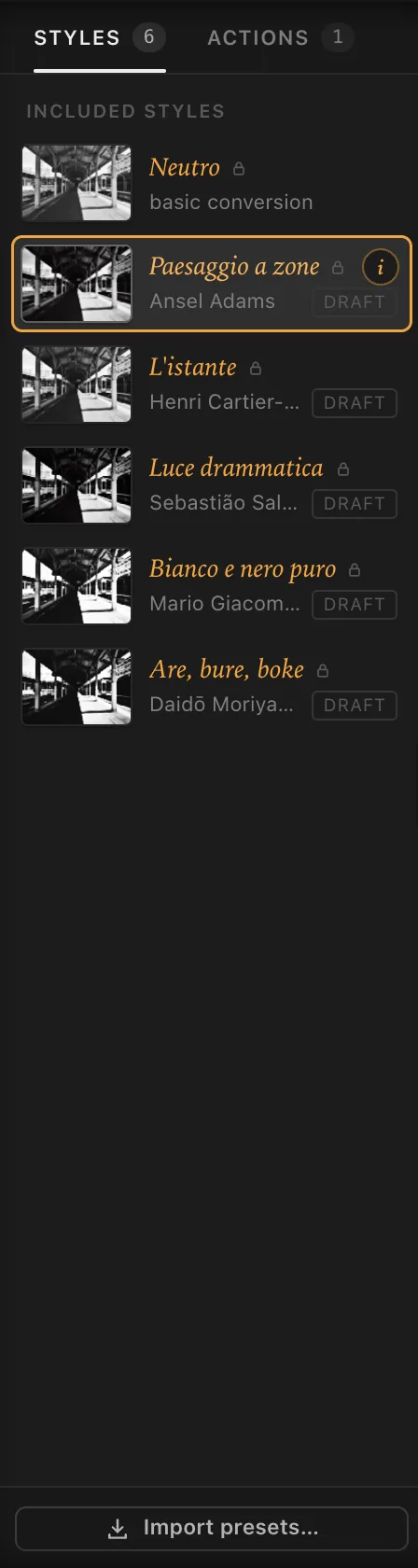
The six styles#
Neutro#
Square one. The photo’s luminance goes through a film with no character of its own, normal development and grade 2 paper, with no filter, no grain and no burning.
It shows you the photo ‘as it is’ in black and white, before any choice is made, and gives you clean values to build a style of your own from. When you don’t know where to begin, begin here.
Paesaggio a zone#
Inspired by Ansel Adams. Landscape by the Zone System: the shadow that matters placed on Zone II or III, the textured highlights on VII–VIII, and a print that holds them all.
- 8×10 sheet film, almost grainless, a slow film with a soft toe and shoulder so the ends of the scale aren’t lost.
- Deep yellow filter No. 15 in front of an uncoated period lens.
- At the enlarger the sky burned in with a gradient from the top, the corners only just darkened.
- Grade 2½ fibre-based paper, selenium toning to deepen the blacks.
Development isn’t part of the style: Adams chose it scene by scene. To decide it for your own photo, use the Spot meter.
Try it on: mountains, skies with clouds, architecture in full light.
L’istante#
Inspired by Henri Cartier-Bresson. Street photography in the service of composition: the moment counts for more than the effect, and the print mustn’t draw attention to itself.
- 35mm panchromatic ISO 400 with no filter, normal development, grain present but natural.
- A soft, full print on grade 2 fibre-based paper, rich greys and blacks that aren’t crushed.
- Only a light edge burn at the enlarger and a hint of halation in the film.
Try it on: the street, people on the move, scenes where the geometry already does everything.
Luce drammatica#
Inspired by Sebastião Salgado. Dramatic light and dense matter: dark skies, figures coming out of the shadow, a print built up with a lot of burning.
- 35mm ISO 400 with a yellow filter to give the sky some body, developed a little beyond normal to separate the tones.
- Strong edge effects for micro-contrast.
- At the enlarger a generous exposure and grade 3, the sky burned in from the top, the edges darkened hard to close the picture in, a touch of selenium on the blacks.
Try it on: heavy skies, against the light, interiors with a single window.
Bianco e nero puro#
Inspired by Mario Giacomelli. Black and white cut to the bone: black marks on white, the midtones all but vanish and the photograph turns graphic.
- Medium format developed long (N+1), printed on the hardest paper, grade 5.
- Grain a little stronger and sharper, edge effects for the outlines.
- Glossy paper for deep blacks.
Try it on: snow, ploughed fields, dark figures against the sky; any photo where the mark counts for more than the tone.
Are, bure, boke#
Inspired by Daidō Moriyama. ‘Grainy, blurry, out of focus’: the aesthetic of the magazine Provoke turns its back on the fine print. Brutal contrast, coarse grain, blacks that eat into the picture.
- ISO 3200 pushed a stop and a half, a high toe and the grain pushed up.
- Strong edge effects and a little halation.
- Grade 4½ on glossy paper, a generous exposure, heavily burned corners.
For the blur and the shake, which the style doesn’t impose, use the Lens and the shake in the Camera stage.
Try it on: night, neon signs, car windows, pictures snatched on the run.
The ‘draft’ mark#
Five styles carry the word DRAFT on their thumbnail, and draft next to the name in the inspector. It means the recipe is still being calibrated: we’re comparing it with prints, and a Procol update may adjust it. You can use it without worry; if you like a print just as it is, save it as a preset: your preset won’t change.
Style info#
The amber i on each thumbnail, and the one next to the name in the inspector, opens Style info:
- the description, in one line;
- How it was conceived: the choices in the recipe and the reasons for them;
- The recipe: stage by stage, one line each, what the style has chosen (for example Pan ISO 100 · 8×10 sheet film in Film, Selenium in Toning).
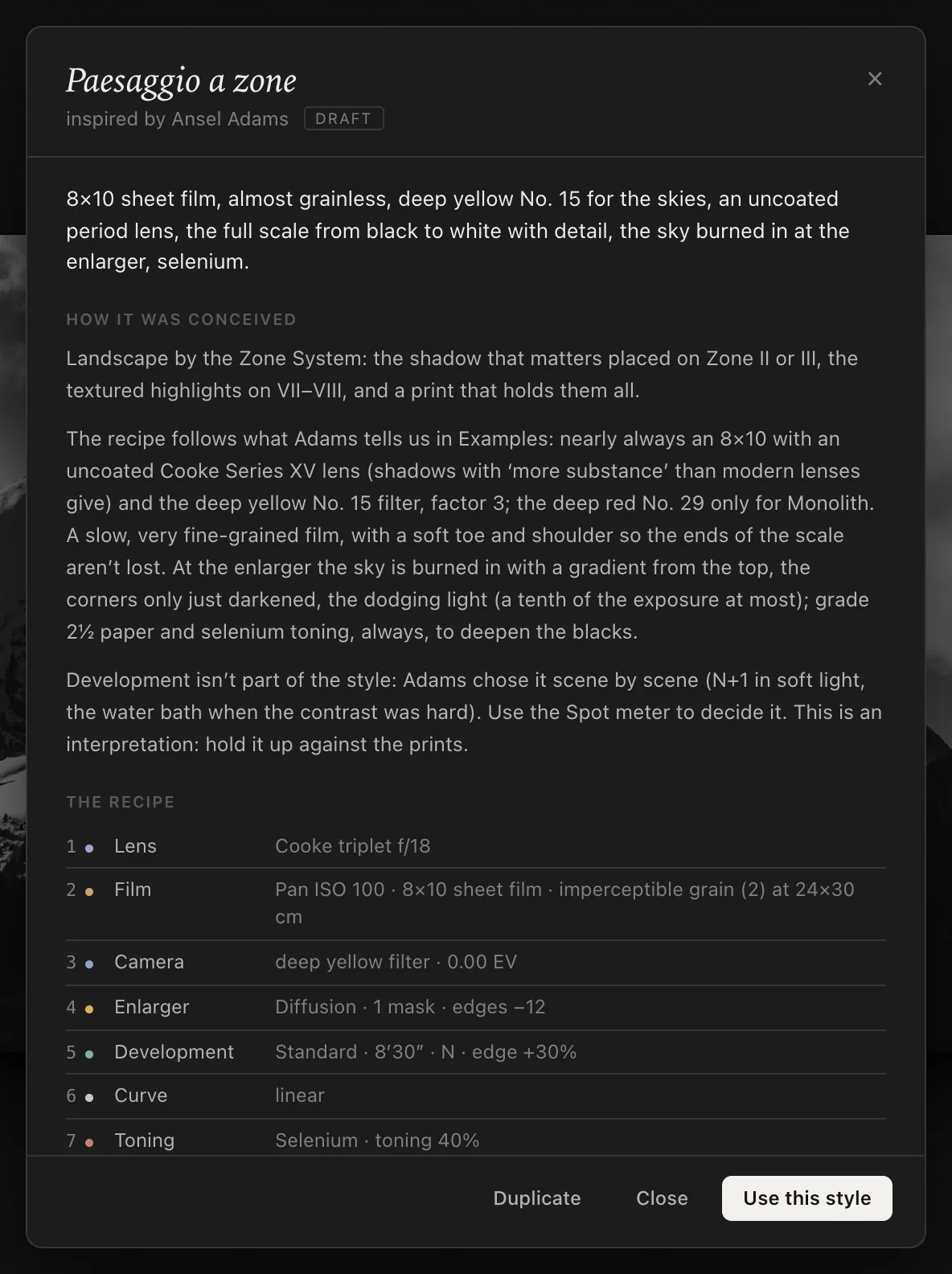
At the bottom, Use this style applies it to the photo; if it’s already the one in use, the button reads Style in use. For your own presets there’s also Delete preset….
Reading the recipe is the best way to learn: you see which steps a style has touched and which it has left neutral, and you understand where to put your hands.
Strength#
Under the histogram, Style strength blends the print with the neutral conversion of the same photo:
- 100%: the full style;
- 50%: halfway between the style and Neutro;
- 0%: the neutral conversion.
It’s the simplest command and one of the most useful. When a style has the right character but is too much for your photo, you don’t have to take it apart stage by stage: turn the strength down. An Are, bure, boke at 60% keeps the grain and the black, but lets the shadows breathe.
Double-click the label to go back to 100%. The most common amounts, 100, 75, 50 and 25%, are also in Image › Style Strength. When you change style, the strength stays where you set it.
Moving from one style to another#
Tap a thumbnail in the Styles column, or:
- Image › Style and choose from the list;
- Image › Previous Style and Next Style (⌥ ↑ and ⌥ ↓), to run through them one after another while watching the print;
- from the keyboard, ⌥ ⌘ 0 for Neutro and ⌥ ⌘ 1…5 for the photographers’ styles, in the order of the column. The shortcuts are written next to the names in Image › Style.
A new style replaces all the adjustments on the photo with its own: it’s a whole recipe, not a retouch to add on top. What stays is whatever belongs to the photo rather than to the recipe: the Crop, the Brush strokes and the strength.
If you had already changed the style in use, Procol asks what to do before switching:
- Cancel: you stay where you are;
- Don’t save: you move to the new style and your changes are lost (they’re still in the history, though, and you can go back from there);
- Save preset…: you save your changes as a preset first.
Comparing several styles at once#
To choose at leisure, open the Proofs (View › Proofs, P): four prints of the same negative, each in a different style, side by side. The ‹ › arrows under each print change its style; Use this one applies it. See Viewing and checking.
From the style to your own style#
The included styles can’t be edited (the small padlock next to the name is the reminder): when you change them, you’re working on a variant. If you like the variant, save it with Save as New Preset…, or start from a copy with Duplicate: it appears under My presets, below the included styles, with its own thumbnail, and from then on it’s a style like the others, with its own i and its own recipe. Everything there is to know about presets is in Working in order.